In what ways does your media product use, develop or challenge the conventions of real media products?
Conventions that it uses: 

1) The mast head is partially covered – I chose to use this convention to shift the focus from the mast head onto my main image.
2) The main cover line is over-laid over the main image – I chose to do this to draw the audience’s attention to the name of the movie that my magazine cover is advertising.
3) The barcode is positioned to the bottom right of the page – the barcode is merely on a magazine for practical reasons and therefore it does not need to be emphasised or placed in a key position upon the cover.
Conventions that it develops:
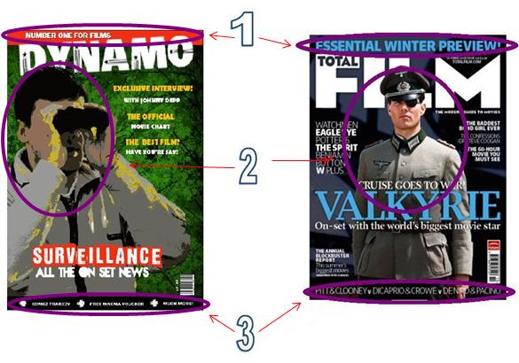
1) The tagline is in a long, thin red box – akin to the shape of a menu strip – I chose to put the tagline in this box to emphasise it as I felt that it was reasonably important.
2) The angle of the shot has changed as I preferred to create depth in my magazine cover by taking the shot on a diagonal.
3) The menu strip at the bottom of the total film cover is just a line of text – I developed this convention by putting the text in a menu strip text box so the text was more easily legible.
Convetions that it challenges:

1) The "Total film" magazine has placed cover lines in both the left and right thirds of the cover - I have only placed coverlines in the right third as they looked to squashed when I experimented and placed them over the main image.
2) I chose to capitalise all text on my magazine front cover to make it easily legible, whereas only some of the text on the "total film" magazine cover is capitalised.
No comments:
Post a Comment