Here is my video blog of comments that I have received about my poster (See below).
Friday, 24 February 2012
Wednesday, 22 February 2012
What next?
Now I have completed my final movie poster, I will now begin to evaluate my movie poster and complete my video blog of peoples comments regarding my movie poster.
Friday, 10 February 2012
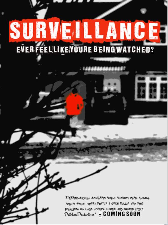
Final draft of my movie poster
Here is my movie poster final draft. I will now begin my evaluation process. (See below)
Thursday, 9 February 2012

Wednesday, 8 February 2012
Addressing the feedback comments
One of the feedback comments that was made about the first draft of my movie poster was that the font needed to be more clear. In order to address this comment and due to Microsoft office’s lack of appropriate fonts, I searched online for “free font” websites.
After searching for a while, I came across a website called “fontspace.com” which I decided to use. I then typed in the word “surveillance” – which I my movie poster title, so that any appropriate fonts would have the word surveillance written.
When I found two or three fonts that I liked, I copy and pasted the font into a Powerpoint presentation document. This might seem strange but the reason for this was that the fonts were copied as pictures and so each had a white background behind them that I needed to get rid of. In the Powerpoint document, I used the “remove background” tool to select the text within the image, thus removing the white background that I did not want. Then I proceeded to copy the text into a “publisher” document, where I postioned the font over the picture used on my poster.
I repeated this process for several fonts until I found two that I was equally happy with. With this dilemma, I printed the two versions of the poster around my peers in sixth form and simply asked them which they thought looked better. The result was the all 20 people that I asked preferred the same poster.
I will now continue to work on that poster – probably adding the credits Ect, before I post it on here.
New images
One thing that I have realised since my first draft is that my organisation of my actors and actresses etc has not been very good atall. Therefore, in order to rectify this I decided to search for a more appropriate location to take my pictures for my movie poster. In the end, after travelling round different areas, I decided that my own street and the adjacent street would be perfect.
I then contacted my actors via email asking them to meet at my house on Saturday for a photo shoot.

I also compiled a short shot list of the images I planned to take and gave each actor a copy of it so they were aware of what shots I was planning and where they were needed etc.

Then after the shoot, I compared the pictures that I took and decided on the most appropriate picture. I included my peers and other media students in this decision to get a better perspective. Here is the image that I have decided to use.

I then contacted my actors via email asking them to meet at my house on Saturday for a photo shoot.

I also compiled a short shot list of the images I planned to take and gave each actor a copy of it so they were aware of what shots I was planning and where they were needed etc.
Then after the shoot, I compared the pictures that I took and decided on the most appropriate picture. I included my peers and other media students in this decision to get a better perspective. Here is the image that I have decided to use.

Friday, 3 February 2012
What I plan to do next
· Take more images of a scenario that is more appropriate to the story line. I will try and keep the focus of the image on a male character, but perhaps will take the photo in a more appropriate setting and have the male character wearing more appropriate clothes. Complete by the: 06/02/12
· I will edit the photos taken and choose the best one. I think I will most likely use the ‘posterize’ and other effects that I have used previously as the feedback suggests that they were successful. Complete by the: 10/02/12
· I will then make the image the background of the movie poster and perhaps edit the size or colour of the title credits at the bottom of the poster. Complete by the: 10/02/12
· I then plan to get any final feedback from my peers and teachers before making any final amendments to the movie poster.Complete by the:10/02/12 (Half term)
· Then I plan to complete an evaluation of the final product. Begin after half term and complete by (approx): 29/02/12
Feedback results
Notes and feedback for the first draft of my ancillary task – movie poster
Question one: What do you like about this movie poster?
· The minimalistic effect
· Colours / blends look good
· The modern art style
· Nothing is given away
· Mysterious
· Bold and powerful
· Simple and effective
Question Two: What do you think I could improve upon?
· Make the movie title more obvious
· The man in the image could be a realistic picture
· The person should be more obvious
· You should have included the clock image instead of this image
Question Three: Keeping this storyline of my movie in mind, do you think that the poster reflects the storyline effectively?
· It shows very little of any relevance; it could be anything
· Hard to establish what is happening in the picture, so no
· The poster has a kind of “To kill a mocking bird” feel to it, executive, classical , highly professional, well done
· Picture needs to be more fitting to the theme
· The text at the bottom isn’t clear
· No, but I like it
· It works well, darker colours might bring out the theme better
Feedback form
Next I decided to create a feedback form so that I could get feedback from my peers and teachers on my first draft. Here is the feedback form. ( see below)

Subscribe to:
Comments (Atom)