Saturday, 7 April 2012

Location Plan

Before deciding where to film my teaser trailer, I decided to do a short location plan to weigh up a few different options. Here is my research (see below).

Wednesday, 4 April 2012

New Technologies

In an attempt to gain just a little more research I have set up my first ever Twitter account purely for A2 media work ( See @A2mediastuff ) I have also posted a "Tweet" asking " What makes teaser trailers so good?" and I hope to receive various comments about back.

My choice to use social media such as Twitter has been made purely on the fact that the main users of twitter and other social network sites are young people - people that are part of my target audience and therefore, I thought that it might be useful to set up a twitter account to gain valuable feedback from such users.

Teaser trailer Research

After completing a short evaluation of my magazine cover, I have now decided to do some research into Teaser Trailers for my main task. Firstly, I decided to log onto the popular web 2.0 site, youtube, and fine some teaser trailer videos.


The first Teaser trailer that I viewed was the trailer for the film "Twilight breaking dawn part 2".
It was only 50 seconds long and mainly used movie footage. It opens with a slide about who made - "Summit entertainment" and then proceeds with an establishing shot of a snowy mountain and a forest. Then there is a series of quick edited clips with lots of close-ups that sometimes fade to black. The background music helps create the tension within the teaser trailer as it sounds almost like a heart beat - that builds up to the final crash! Near the end of the clip the title of the movie is shown. There is then a short piece of footage of the main female actress before the date "November 16" appears on the screen - there is also three links to the film, one via twitter (the #tag symbol), one via facebook and one via the films official website. 

The second Teaser Trailer that I viewed for research was the teaser trailer of one of my favourite films - the inbetweeners. This teaser trailer is 1:06 minutes long and conventionally opens with a slide showing the producers of the movie ( bwark productions etc). Throughout the teaser trailer the music is used to suggest that all of the actors are drunk as it is very hazy, the shots are also sometimes blurred to further suggest this. There are a variety of different shots as the main four male character walk down a crowded high street in the center of a very popular holiday destination. There is also a part of the teaser trailer where time is sped up to show all the different situations that the four boys find themselves in throughout the movie. There is quite a lot of panning in the teaser trailer and this is mainly used (in my opinion) to show the wider picture - all of the things that a simultaneously happening in this street full of clubs and bars. There are a lot of vibrant colours and neon lights are also captured within the footage to reinforce the 'club scenario' that the boys are entering. Finally, the movie logo appears on a black screen whilst the character Jay says a famous line from the movie whilst the words "Summer 2011" appear on the page.

The third teaser trailer that I have analysed was the teaser trailer for the movie "The dark knight rises " - a movie that is due to be released in the summer of 2012. This teaser trailer is 1:36 minutes long and begin (as all the others have) with a slide showing the producers of the movie which in this caseare "Warner Bros pictures". As the teaser trailer begins, there is a voice over along with mood music whilst on screen there are the words " every hero has a journey" and then "Every journey has an end". The music builds until the teaser trailer shows a short clip of one of the main characters in a hospital where a sad minor violin piece begins to play which links nicely to the sadness shown in the actors face. There is then a scene where the whole world seems to be falling to pieces as the glass of many high rise builds shatters - symbolising the evil forces at work (I would imagine). The teaser trailer ends with closing credits and the words "Summer 2012".

The fourth and final teaser trailer that I watched was the teaser trailer for the movie "The devil inside". It is only 38 seconds long and consists of a text transcript that is shown on a black screen. The text begins by explaining to the viewer that this is an "actual 911 call made from the home of Maria Rossi on October 30th 1989". The coversation begins between Maria Rossi and the call operator as a voice over and ends when Maria Rossi puts the phone down after admitting that she had killed three people. In my opinion the overall lack of information an footage makes your want to know more about the movie as there is nothing( except the fact that a murder has been commited) that is given away. The movie title or anyway of finding anything about the film is not even given.

After briefly researching teaser trailers, I have now found out that there are certain conventions that most teaser trailers adopt - such as showing the name of the company who produced the movie before the teaser trailer really begins etc.


Tuesday, 3 April 2012

Ancilliary Task Evaluation part three

When responding to the question: What media technologies did you use in the construction of your ancillary task, I dedided to create this mood board with all the technologies that I have used throughout  the planning, research and construction stages of my ancillary task (see below).

Magazine cover evaluation part 2

Monday, 2 April 2012

Magazine Cover Evaluation part one


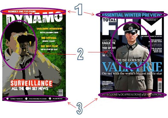
In what ways does your media product use, develop or challenge the conventions of real media products?


Conventions that it uses:        


1)   The mast head is partially covered – I chose to use this convention to shift the focus from the mast head onto my main image.
2)   The main cover line is over-laid over the main image – I chose to do this to draw the audience’s attention to the name of the movie that my magazine cover is advertising.
3)   The barcode is positioned to the bottom right of the page – the barcode is merely on a magazine for practical reasons and therefore it does not need to be emphasised or placed in a key position upon the cover.


Conventions that it develops: 


1)   The tagline is in a long, thin  red box – akin to the shape of a menu strip – I chose to put the tagline in this box to emphasise it as I felt that it was reasonably important.
2)   The angle of the shot has changed as I preferred to create depth in my magazine cover by taking the shot on a diagonal.
3)  The menu strip at the bottom of the total film cover is just a line of text – I developed this convention by putting the text in a menu strip text box so the text was more easily legible.


Convetions that it challenges:


1) The "Total film" magazine has placed cover lines in both the left and right thirds of the cover - I have only placed coverlines in the right third as they looked to squashed when I experimented and placed them over the main image.
2) I chose to capitalise all text on my magazine front cover to make it easily legible, whereas only some of the text on the "total film" magazine cover is capitalised.

Sunday, 1 April 2012

Feedback


As part of my feedback / evaluation I decided to ask my family and friends to describe my magazine movie cover in one word (or a short phrase). I then typed all these words into the "wordle" website to create my wordle (see below).

Friday, 30 March 2012

What I plan to do now...

1) Some form of feedback from my friends and family - to be completed by Sunday 1st April
2) Evaluation of my magazine cover - to be completed by Wednesday 4th April
3) Teaser Trailer research - to be completed by Friday 6th April
4) Location plan - to be completed by Saturday 7th April
5) Props list and Costume list / ideas - to be completed by Monday 9th April
6) Brief shooting plan - to be completed by Tuesday 10th April
7) Risk assessment and release forms - to be completed by Wednesday 11th April
8) Trial of any props - to be completed by Thursday 12th April
9) Storyboard - to be completed by Friday 13th April
10) Shooting the footage - to be completed by Sunday 15th April
11) First edit - to be completed by Tuesday 17th April

My Magazine cover final draft

Here is the final draft of my magazine cover ( see below ).


Thursday, 29 March 2012

Replys to my Feedback email

I have now received various responses to my email asking for feedback. On the whole, the comments were quite good, as most people liked aspects of my magazine. However, a few improvements have been suggested such as: changing the font or background colour of my magazine. Here are print screens of the responses ( see below)


How will I use this feedback? 
After receiving this feedback, areas of improvement have been drawn to my attention and so here is what I plan to do next...
  • I plan to alter the font - to make it clearer
  • I plan to include a barcode and a price - most likely £2.50 as that is towards the lower end of the price range that i was given during my facebook research ( the highest price was £5 and the lowest was £2)
  • I plan to try and alter the background of my magazine - making it less yellow!

Feedback

In order to generate some feedback for the 2nd draft of my magazine cover, I have emailed a few of my peers and the sixth form manager asking them for their opinions on my product. Here is the print screen of the email that I sent yesterday (see below) , I am hopeful to receive some good feedback points.

Tuesday, 27 March 2012

Image edits - how I created the image for the second draft of my magazine cover

Here is my original image. I decided to take a picture of one of my peers in a bush because I thought the it would suggest that they were secretly observing somebody – and of course not wanting to be seen as they are hiding within the canvas of the bush. I also chose to make my peer hold a pair of binoculars as I feel that they are a symbol for the surveillance that is taking place. Finally, I chose for my peer to wear one of my dad’s old sweat shirts so that he would look older ( ie married and a barrister – like I had previously mentioned in my storyline)


When I began the editing process, I chose to use the online programm “picnik” to edit my images; as after using it on a more regular basis, it has now become my prefered editing programm. I then tried to edit a green “film” effect over the image but then didn’t feel that it was effective enough so I decided to disguard that effect.


Akin the image that manipulated for my movie poster, I added the “posterize effect” to this image to immitate the style of my movie poster – thus creating a sense of cohesion between the two products.


Finally, I blurred and darkened the edges of the image so that the focus was upon the person in the picture. Therefore, the attention of the audience is drawn to this focus.


Second Draft of Magazine cover

Here is the second draft of my magazine cover, as you can see a lot has changed about it since my first draft, however I have kept some similar features such as the font of the coverlines etc. ( see below)

Sunday, 25 March 2012

Research into fonts

I have conducted some research into possible fonts that I could use for my Mast Head on the next draft of my magazine cover (see below).
Research into possible fonts

Friday, 23 March 2012

Shot list

Here is a brief shot list of the images that I plan to take for my magazine cover.

Tuesday, 20 March 2012

Feedback

 After speaking to my peers I have produced a short presentation on the website “prezi” to record these comments and to plan my route forward. Here is the link to the website:


Monday, 19 March 2012

First Draft of magazine front cover

Here is the first draft of my magazine cover (see below). I aim to collate some feedback by this Wednesday ( 21st march).

Thursday, 15 March 2012

Image edits

Here is my original image.


As the background in this image does not fit the magazine, I then eddited it all out by removing most of the background with the "remove background" tool on Microsoft Powerpoint Presentation, and then i touched up the image in the programmes "Paint" and "fireworks".


After that I uploaded the image onto the online editing site "picnik" and added various effects such as "teeth whitening " "belmish hiding" and "sunless tan". To make the image look more "celebrity-like".


Finally, I altered the "lip colour" of my lips to make it look as if I am wearing make up and I used the "airbrush" tool to make the " sunless tan " look more natural. Here is my finally image.


Wednesday, 14 March 2012

Images for the magazine front cover

Here are the images that I have taken. Throughout the process of composition, I had a few issues with finding actors / actresses and so, I instead got a family friend to take pictures of myself and another actor dressed in formal attire. I then took pictures of the set that I have created in school. I then went through my pictures and fiound the best two. I now aim to edit these two pictures together. (see below)


Friday, 9 March 2012