Media ancillary task evaluation
What were your ideas behind the content of this poster, and what new media technologies did you use to reproduce those ideas?
The main theme for my movie poster was surveillance, as my story line heavily focuses upon the idea of a man stalking a young woman that reminds him of his late wife. When first composing images, I chose to focus upon objects such as maps and clocks that might symbolise the theme of surveillance. However, due to the poor quality of my camera phone, I discarded those images almost immediately.
Then, after borrowing the school’s camera, I set out again to take more, similar images – but this time I decided to also focus some of the pictures upon a male character within the movie by suggesting in the photos that he was watching somebody. At first I thought that this was quite successful, as in the poll of two edited images (the injured clock image and the picture of the male character watching from under a porch way within the school), the image of the male character was the most popular. However, I then found that I was receiving feedback comments from my movie poster first draft poll highlighting the irrelevance of the image to the storyline.
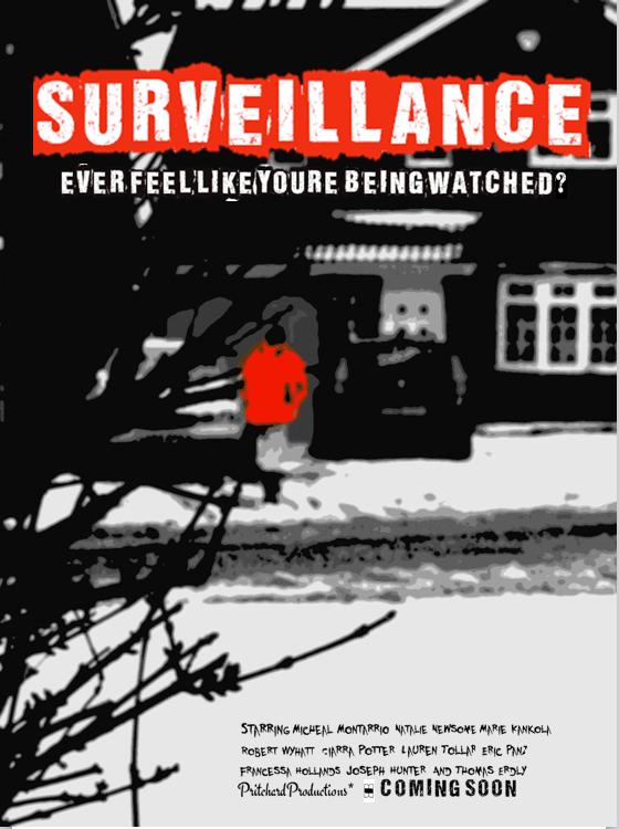
In an attempt to combat this problem, I decided to take more photos with the school’s camera off school premises in order to make everything in my image relevant to the storyline and overall theme of surveillance. Over a weekend I took around 50 different images, giving myself a wide variety of photos to choose from. At first I chose my top 10 images and then shared them with my peers and family members asking for advice on which image they preferred. Finally, I came to the decision of using the image on my final movie poster – an image of a female character walking up the drive towards her house. The photo was actually taken from behind a bush so there are also some branches featured in the image. In my opinion this adds to the overall theme of surveillance within the image, as to me it suggests that someone is hiding in the bushes, and that they don’t want to be seen.
In the original image, the female character is wearing a vibrant red coat. This is because I know that the colour red has strong connotations with being a target as well as symbolising blood and danger. This use of mise-en-scene will help to suggest to my audience that the female character is the target of the male protagonist, whilst for shadowing later violence within the movie. And, after looking at my video blog, most of the participants commented on this use of mise-en-scene as being very successful in communicating the idea of surveillance.
Throughout the editing process of the original image I have used various different on and offline programmes. Firstly, I used “Picnik” – the online editing programme. With this programme I decided to put a colour boost on the picture to increase the vibrancy of the colours. Next I applied the ‘Posterize’ effect to the image - I did this to make the image look more blurred, as I wanted to create a sense of mystery in the image. Personally, I felt that this was very successful, as I was happy with the effect; however one of my peers who participated in the video blog commented that the image needed to be more defined. Then in the offline programme “Paint”, I changed the colour of the garage door on the house from orange to a light brown so that the victim within the image would stand out more from the background. I then used the editing program “Fireworks” to smudge the light brown colour in order to make the image look more realistic and professional, by making the outline of the colour less sharp. After this process, I was almost completely happy with my image but I felt that something was missing from it so I decided to show it to a few of my peers.
After showing this image to my peers for verbal feedback, many said that the plant pot within the image looked “out of place” and that the setting did not look “mysterious” enough. In response to this feedback I went back to the programme “paint” and removed the plant pot from the image. I then loaded the image into the programme “photoshop” to add a black and white layer over the image which obviously made the whole image black and white. I chose the black and white layer with a view of making the image look more mysterious. But, after reviewing this I thought that it took away my initial idea of the woman’s red coat – making her the target of the image. So, finally I decided to ‘rub out’ the effect over the coat area which made the woman’s coat stand out red again. After rubbing out the effect over the woman’s coat I was happy with the image, as it now looks more mysterious but does not lose the original purpose of portraying the woman as a target.
When constructing my movie poster, I then copied this final image into the programme “publisher” and fitted to the screen. Before continuing any further however, I decided to review the other feedback comments that I was given in the poll of my movie poster first draft. One of the feedback comments made about the first draft of my movie poster was that the font needed to be clearer. In order to address this comment and due to Microsoft office’s lack of appropriate fonts, I searched online for “free font” websites.
After searching for a while, I came across a website called “fontspace.com” which I decided to use. I then typed in the word “surveillance” – which was the title I wished to use on my movie poster, so that any appropriate fonts would have the word surveillance written. I chose the word “surveillance” as I thought it was important to have anchorage on my movie poster and what could more clearly depict the meaning of my movie poster than the theme itself?
When I found two or three fonts that I liked, I copy and pasted the font into a Microsoft “Powerpoint” presentation document. This might seem strange but the reason for this was that the fonts were copied as pictures and so each had a white background behind them that I needed to get rid of. In the “Powerpoint” document, I used the “remove background” tool to select the text within the image, thus removing the white background that I did not want. Then I proceeded to copy the text into a “Publisher” document, where I positioned the font over the picture used on my poster.
I repeated this process for several fonts until I found two that I was equally happy with. With this dilemma, I printed the two versions of the poster and distrubuted it around my peers in sixth form simply asking them which they thought looked better. The result was all 20 people that I asked preferred the same poster. Then, when choosing the font for my movie poster credits I repeated this process.
How does your movie poster use, develop and challenge the conventions of existing media products?
In my opinion, the anchorage on my movie poster is very cliché with existing conventions of media products, as typically in movie posters rhetorical questions are used. The tagline “Ever feel like you’re being watched?” creates a frightening tone to the movie poster whilst addresses the audience with the pronoun “You’re”. It also helps the audience member to feel involved in the media, as the question is employed to include them by directly addressing them.
My movie poster also uses the common movie poster convention of placing the credits at the bottom of the poster. I think I choose to use this convention because I believe that it would distract the audience’s attention from the main title etc if they were placed somewhere else on the movie poster.
Although I have used many conventions of existing media products, I think that I have also challenged the conventions of movie posters. Throughout the research stages of my project, I have identified that in Kubrick's posters the title of the movie is most commonly placed across the bottom of the poster. However, I challenged this convention from the first draft of my movie poster, as I believe that a title catches the eye better if it is placed in a central top position on the poster. I think this because, when thinking back to last year when I completed my foundation portfolio, part of my task was to produce a magazine front cover, and after analysing various magazine front covers, I found that the title of the magazine was positioned across the top of the magazine. So, I chose to employ this convention of magazines to my movie poster.
I have also challenged the conventions of movie posters that I have researched. The two Stanley Kubrick posters that I have analysed both featured close ups of the faces of characters. However, I challenged this convention because I wanted to reinforce the idea of surveillance from a distance, therefore I did not zoom into the face of the actress featured on my poster. I feel that this was successful because by not focusing on the face of the character, a sense of surveillance from a distance is created, whilst it makes the character seem more anonymous as you cannot see any of her facial features.
Who is the target audience for your movie poster and how have you targeted them?
My target audience is predominantly people who like horror movies, but I have also aimed my movie poster at a young to middle aged audience as the character featured on the poster is in her late teens; however, the audience cannot see that as the image is blurred. The other characters that will feature within the movie teaser trailer and possibly on the magazine cover are also between 18 and 25 - which will help to reflect my target audience. Furthermore, I think that the target audience of my film would more likely be males than females, as many females who have helped me through the evaluation and feedback period of this ancillary task have mentioned that they would not watch the movie because they do not like the horror genre of film, whereas the males seem more interested in the horror genre.
I believe that my movie poster will appeal to people of all classes because it does not exclude any class of people in any way. However, people who have a more disposable income and (are therefore stereotypically a higher class) are more likely to be able to afford to watch other forms of media, such as plays in the theatre, and therefore might have less of an interest in films in general.
As part of my evaluation process I have produced a short video blog comprised of various comments about my movie poster. After watching back this video blog, I believe that I have been reasonably successful in targeting my audience through my movie poster. I believe this as both Tobiah Dawkins and Jess Cummings (two of my peers who participated in the video blog) said that they would like to see the movie if it were ever made.
In order to attract my target audience, I have also used a modern type face on my poster. I think that this will attract a younger audience as (as a teenager) I am aware how important it is for media forms to be constantly updated and to look new and more interesting than previous media forms.
If I were to distribute this movie poster in order to attract my target audience, I would probably feature it on social networking sites such as twitter and facebook, as many teenagers and young adults use such forms of web 2.0, and therefore they would be more likely to see it. I think I would also advertise the poster in places that my target audience would visit such as take away restraurants, high street stores, music venues, pubs, clubs and bars. But in order to make other possible audience members aware of the movie, I would also put the poster on the side of buses and other forms of public transport.
If you were to improve anything on your movie poster what would be and why?
I think, if anything, I would make the “coming soon” at the bottom of my poster larger so that there was more emphasis on the movie being in the cinemas soon. I also think that if I had had a wider knowledge of technology I would possibly have been able to isolate the female character featured on the cover and make her less blurry, whilst making the scenery behind (the house) look more blurred in order to create a greater sense of mystery. Another improvement would be to include the release date of the film on the poster so that possible audience members can make a mental note of when the film would be in cinemas. If I were to be extremely critical of my movie poster, I would say that the spacing of the words in the tagline “Ever feel like you’re being watched?” is too cramped, and to improve I would perhaps double space between each word to make it more easy for the audience to read. But, apart from those improvements, I don’t think I would change much else about my movie poster if I were to redo this task, as I am very happy with the final poster.