Friday, 4 May 2012

Evaluation Part four:

How did you use media technologies in the construction and research, planning and evaluation stages?

What did I use?

Google images: I used google images to get images of Stanley Kubrick’s work and for examples of existing media products such as Total Film and Empire magazines, as well as successful film posters. I also used it to source a copyright free barcode for my magazine front cover because after trying to make a barcode of my own, I didn't think that it looked realistic or professional enough.

Wikipedia: I used Wikipedia to gain information about Stanley Kubrick in the planning stages of my portfolio. I also used it to gain statistics about Total Film and Empire magazines.

HTC Wildfire S camera phone : I took the first set of pictures for my movie poster on my phone, however I soon found out that the camera wasn’t really of a high enough quality to complete my coursework with. But, I did utilise the voice recording device on my phone to record the interview about Stanley Kubrick between myself and Natalie Newsome.


Camera Equipment:  I used the school’s camera to take the still images used on my movie poster. I found that the quality of the camera far excelled the quality of my camera phone.  I used my mum’s camera to capture photos that I used on my magazine and the video footage used within my teaser trailer. I chose to use my mum’s camera over the school camera because my mum’s camera was of a slightly better quality and it was a newer model of the school’s camera.


Youtube:  I used Youtube as a research tool for finding information about teaser trailers as I could view any teaser trailer from any film that I wanted to. I did consider using Youtube as a platform to upload my final teaser trailer to, however I decided against it because if I had, my media blog would have been blocked by the school computers and therefore I would not have been able to make any changes to it during school time.
Picnik: Picnik is an online editing website where there is a facility for users to upload their photo and then edit it, however as of April Picnik no longer existed, as Google purchased it and added it to their other services. Picnik was my primary image editing tool as it is free and very simple to use. I have edited all of my images on Picnik as there is a very wide variety of effects available to use. The software also allows you to edit both minute details like the colour of someone’s teeth and more general details such as the overall tone and contrast of the image.


Paint: I used paint to occasionally to edit my photos by editing very minute details such as the colour of a certain area or rubbing out features of an image. Although Paint isn’t really an editing tool, I found that it was very helpful for those last minute touch-ups to an image, and of course is extremely simple to use.


Fireworks: I used fireworks occasionally to edit my image by isolating a certain area of my photo. For example when creating my movie poster, I isolated the red coat in the image so that it would stay the same, then I selected a black and white film to overlay onto the image – making it look ,more professional. At first I avoided programmes like Fireworks because I have a very limited knowledge of them and struggled to use Fireworks at first. However, after my teacher suggested a forum website explaining about Fireworks I visited it and found it much easier to use and actually enjoyed using it.
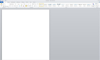
Microsoft word: I used Microsoft word to word process all of my posts before uploading them to my blog to try and eliminate the majority of spelling mistakes on my blog. I also used it to create my questionnaires and polls and to record other audience feedback. I think this is mainly because it is a programme that I am very familiar with and can use with ease so it saved me time.

Microsoft Publisher:  I used Microsoft Publisher in the production of both of my ancillary tasks. I think that I chose to use Microsoft Publisher because it is a program that I feel comfortable using.

Microsoft Power point: I used Microsoft Power Point to create the slide shows that I uploaded to the slide share website. I also used the "Remove background" tool within the program so that I could remove the white background from the fonts that I downloaded from Fontspace.   

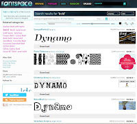
Fontspace: I stumbled across fontspace when searching for free fonts on the internet. As it was one of the most popular websites (higher up the google search list than others) I decided to give it a go. I used the website to source new fonts for both of my ancillary products as well as the "Surveillance" logo.
Windows Movie Maker: I used Windows Movie maker to edit video footage that I have produced throughout the course of my advanced portfolio such as the video explaining how to make the fake blood for my teaser trailer and the interview video that I produced when researching the director Stanley Kubrick. I also used it to edit and produce my teaser trailer as it is the editing software that I am most happy and comfortable using. 
Slideshare: I used slideshare to upload my powerpoint presentations onto the internet. Slideshare was particularly useful because it gave me the option to embed the powerpoint into my blog and for it to work like a slide show rather than be a still image.  I also found it really fun to use! 
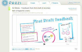
Prezi: I briefly used prezi in my advanced portfolio when reflecting upon the feedback that I was given after the first draft of my magazine front cover. I used it to create a presentation where I explained the positives and negatives of my first draft, as well as identifying what I needed to improve upon. In the future I would love to use Prezi again as I thought that the website was really good, I just found it a bit difficult to use - as there are many easier alternatives available on the internet. 


Issuu: I used ISSUU to process my PDF documents into online books without any hassle. I first found out about it when browsing the internet looking for more interesting and innovative ways of presenting my work. I used it to present my questionnaire results and my storyboard for my teaser trailer. I also used it an evaluation of one of my ancillary tasks.

Office Outlook Web Express: I used Office Outlook Web Express to send emails to my actors and actresses to let them know when rehersals were. I also used it to communicate with Jamie Fairhurst when asking for music for my teaser trailer and also when I asked for feedback from my peers. I found that it was a valuable tool to quickly and easily contact people and get a reasonably swift response.

Facebook: I used facebook and other social networking sites such as twitter to generate feedback from my target audience. I also used facebook as a site where all three of my products could come together and be shown on - primarily to generate more interest for the teaser trailer and advertising package as a whole.

In conclusion, I am amazed at how many different media technologies that I have used in the construction, research and evaluation stages of my advanced portfolio. Furthermore, I have learnt how to use lots of these new technologies such as Picnik, ISSUU, slideshare and prezi - technologies that I probably never would have even discovered if I hadn't been completing my advanced portfolio.


Tuesday, 1 May 2012

Evaluation Part Two:

Here is a brief commentary over my teaser trailer explaining what conventions of movie teaser trailers I have used, developed and challenged in my teaser trailer. 

Monday, 30 April 2012

Saturday, 28 April 2012

BBFC Rating Research

I have decided to research the BBFC film ratings in order to place my teaser trailer in the appropriate category.  I have read through the latest guidelines on the website and have come up with these key points for each category.


PG
“Moderate violence, without detail, may be allowed if justified by its content (for example history, comedy or fantasy)”
“Frightening sequences should not be prolonged or intense”

12 / 12A
“Moderate violence is allowed but should not dwell on detail. There should be no emphasis on injuries or blood, but occasional gory moments may be permitted if justified by the content.”
“Moderate physical and psychological threat may be permitted, provided disturbing sequences are not frequent or sustained.”

15
“Strong threat and menace are permitted unless sadistic or sexualised.”
“Dangerous behaviour (for example, hanging, suicide and self-harming) should not dwell on detail which could be copied. Easily accessible weapons should not be glamorised.”
“Violence may be strong but should not dwell on the infliction of pain or injury. The strongest gory images are unlikely to be acceptable.”

After reading these guidelines, I have come to the decision that my teaser trailer should be rated a 15 as throughout the film (if it were to be made) there would be the strong threat from the stalker, dangerous behaviour displayed when the female character is shot - however, the film would not dwell on the death - only showing brief footage of the gory image. And, as the weapon is not shown, I would not deem the weapon to be glamorized.  

Friday, 27 April 2012

Thursday, 26 April 2012

Poll on facebook

On monday afterposting my second draft I created a poll on facebook asking what people thought of my teaser trailer. The results are as follows.

Tuesday, 24 April 2012

Reply from Jamie

Ive just received a reply from Jamie which includes the music that I requested from him. I think I might try using this music with my Teaser trailer and see if it sounds any better that the music I currently have (which was taken from a copyright free website.


Monday, 23 April 2012

Second draft

Keeping the comments in mind that were given on my facebook page, I tried to alter my teaser trailer accordingly by incorporating more twilight shots. However, I decided against using a voice over, as when I could not get a good enough quality recording with the devices available to me.


Saturday, 21 April 2012

Response to comments

After reading the facebook comments, I have decided that I need more twlight / night footage. Therefore, I plan to film more footage this weekend. Here are a few shots that I plan to compose.

Shot 1

Shot 2


Shot 3


                                                                          Shot 4


                                                                         Shot 5


Shot 6


Shooting Schedule

Shot list


Friday, 20 April 2012

Facebook Comments

Here is the feedback from my facebook page (see below). It was nice to read the feedback comments that were given and I think I will try to adjust the next version of my teaser trailer with these comments in mind. Especially by trying to include some twilight / night time shots. I might also try to put a voice over onto my teaser trailer.


Thursday, 19 April 2012

Facebook account set up

Here is just a quick print screen of my facebook account - already getting some "like"s etc - I will upload a print screen of the comments in response to my first draft of my teaser trailer either later today or tommorow.

Wednesday, 18 April 2012

Plan going forward

                          Plan
  • Address any feedback that is given in my facebook comments section - complete by Monday 23th April
  • Subsequent draft (Possibly) - complete by Tuesday 24th April
  • Final Draft - complete by Monday 30th April
  • BBFC classification website - complete by Tuesday 1st May
  • Evalaution - complete by Thursday 3rd / Friday 4th May

Tuesday, 17 April 2012

Targetting my audience

In an attempt to target my audience I have created a facebook account for my teaser trailer the account is called: " Surveillance The-film "and the link to the account is: http://www.facebook.com/SurveillanceTheFilm/  if you are interested in having a look at it. So far, I have added about 6 friends to the account and am in the process of adding more. The idea is that I post my teaser trailer drafts onto facebook and then my target audience can respond to it via the comments feature. I can then address those comments and make the ammendments to my teaser trailer so that I am sucessfully adapting my work for my target audience. The reason I have chosen to create this facebook account is because my target audience is a similar demographic to the majority of facebook users - people around the same age as myself.

Teaser Trailer first edit

Here is the first edit of my Teaser Trailer (see below).


Editing process

Here's a screen shot from my editing process. As you can probably see, I have been editing it on Windows Movie Maker.

More about new technologies

Unfortunately, I have experienced lots of problems since setting up a twitter account for my media project. One of the main problems is that most of my peers, friends and family do not have twitter accounts and so, so far I have only managed to add about 5 friends. Also, the people that I have added are very busy and havent had time to comment on my "Tweets" and so I still do not have any comments. I have learnt that sometimes new technology is not the be all and end all. And, although social networking site such as Twitter are very popular - not everyone who is in the age category of my target audience uses Twitter. I have also learnt how to use twitter, which of course may help me in the future.

Monday, 16 April 2012

How I made the fake blood

After many problems with technology I have finally been able to convert the video files into the correct form and have managed to upload it to blogger! (see below)


Copyright free music for my teaser trailer

As I am aware, I am not allowed to use any copyright material within my coursework, therefore I have come up with two possible ways of getting copy right music for my teaser trailer.

Firstly, I contacted my friend who is currently a university student studying music asking him if it would be possible for him to compose a short piece of music for my teaser trailer.


Secondly, I have researched for copyright free sound effects and music online.

Release forms

Here are the signed release forms from Beth Pritchard and Dean Richardson (see below).

Shot list and shooting schedule

Here is the shot list and shooting schedule that I used over the weekend to shoot my footage (see below).  Also, just a brief note about the Trial of the fake blood - I did make the video but I am having a bit of difficulty in uploading it to blogger I will post it as soon as I have rectified the problem.

Thursday, 12 April 2012

Teaser Trailer StoryBoard

Here is my storyboard - I haven't forgotton to trial the fake blood (the task before this on my checklist plan) however I decided to complete my story board before making the fake blood as I need to go and get the ingriedents for the fake blood before I can trial making it.

I also decided to process my story board via the ISSUU site so that you can flick through the various pages of shots, as I thought this would make it more interesting for anyone visiting my blog.
 (See below)

Wednesday, 11 April 2012

Risk Assessment

I have completed a short risk assessment of the possible risks to the participants and myself whilst we are filming my teaser trailer (see below). I will take all of the preventative measures outlined below when filming to ensure the safety of all concerned. I will also have someone first aid qualified (my mum) on site at all time in case of any injuries etc.


Release form

I composed a short release form this morning and altered the wording slightly for the actors and for the occupants of the property that I am filming and photographing. Here is the signed form from the ocuppants of the property (unfortunately it has been scanned into my computer and so is missing the edge of the words on the right hand side)  - I will get my actors to sign their forms before filming commenses.


Tuesday, 10 April 2012

Brief shooting plan for my teaser trailer

Here is the brief shooting plan that I have drawn up (see image below) - stating the dates etc of when I plan to shoot the footage for my teaser trailer.

Monday, 9 April 2012

Props and Costumes list

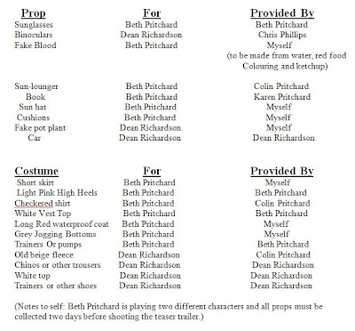
With a brief idea in mind of what frames etc. I am going to capture for my teaser trailer, I have composed a brief props and costume list so that I know what props and costumes I actually need and where I can get them from etc. (see List Below).


Sunday, 8 April 2012

Costumes

I have decided to create a costumes mood board in order to trial possible costumes for my actors (see below) .

Photos of my actors

Here are the photographs of my actors (see below)

  Dean Richardson
I picked Dean Richardson because he is 19 years old ( which is in the age range of my target audience) and has some limited acting experience. He also lives reasonably locally to me so when I need him to attend rehearsals and movie shoots he won't have to travel far.


                           Beth Pritchard
Although Beth Pritchard is a little younger than me target audience (at only 15), I have chosen her as my actress as she has acted before in amateur plays and also for my media a-level foundation portfolio.
She is also my sister so I won't have any problems getting her to rehearsals or movie shoots etc as she can travel with me.

Saturday, 7 April 2012

Location Plan

Before deciding where to film my teaser trailer, I decided to do a short location plan to weigh up a few different options. Here is my research (see below).

Wednesday, 4 April 2012

New Technologies

In an attempt to gain just a little more research I have set up my first ever Twitter account purely for A2 media work ( See @A2mediastuff ) I have also posted a "Tweet" asking " What makes teaser trailers so good?" and I hope to receive various comments about back.

My choice to use social media such as Twitter has been made purely on the fact that the main users of twitter and other social network sites are young people - people that are part of my target audience and therefore, I thought that it might be useful to set up a twitter account to gain valuable feedback from such users.

Teaser trailer Research

After completing a short evaluation of my magazine cover, I have now decided to do some research into Teaser Trailers for my main task. Firstly, I decided to log onto the popular web 2.0 site, youtube, and fine some teaser trailer videos.


The first Teaser trailer that I viewed was the trailer for the film "Twilight breaking dawn part 2".
It was only 50 seconds long and mainly used movie footage. It opens with a slide about who made - "Summit entertainment" and then proceeds with an establishing shot of a snowy mountain and a forest. Then there is a series of quick edited clips with lots of close-ups that sometimes fade to black. The background music helps create the tension within the teaser trailer as it sounds almost like a heart beat - that builds up to the final crash! Near the end of the clip the title of the movie is shown. There is then a short piece of footage of the main female actress before the date "November 16" appears on the screen - there is also three links to the film, one via twitter (the #tag symbol), one via facebook and one via the films official website. 

The second Teaser Trailer that I viewed for research was the teaser trailer of one of my favourite films - the inbetweeners. This teaser trailer is 1:06 minutes long and conventionally opens with a slide showing the producers of the movie ( bwark productions etc). Throughout the teaser trailer the music is used to suggest that all of the actors are drunk as it is very hazy, the shots are also sometimes blurred to further suggest this. There are a variety of different shots as the main four male character walk down a crowded high street in the center of a very popular holiday destination. There is also a part of the teaser trailer where time is sped up to show all the different situations that the four boys find themselves in throughout the movie. There is quite a lot of panning in the teaser trailer and this is mainly used (in my opinion) to show the wider picture - all of the things that a simultaneously happening in this street full of clubs and bars. There are a lot of vibrant colours and neon lights are also captured within the footage to reinforce the 'club scenario' that the boys are entering. Finally, the movie logo appears on a black screen whilst the character Jay says a famous line from the movie whilst the words "Summer 2011" appear on the page.

The third teaser trailer that I have analysed was the teaser trailer for the movie "The dark knight rises " - a movie that is due to be released in the summer of 2012. This teaser trailer is 1:36 minutes long and begin (as all the others have) with a slide showing the producers of the movie which in this caseare "Warner Bros pictures". As the teaser trailer begins, there is a voice over along with mood music whilst on screen there are the words " every hero has a journey" and then "Every journey has an end". The music builds until the teaser trailer shows a short clip of one of the main characters in a hospital where a sad minor violin piece begins to play which links nicely to the sadness shown in the actors face. There is then a scene where the whole world seems to be falling to pieces as the glass of many high rise builds shatters - symbolising the evil forces at work (I would imagine). The teaser trailer ends with closing credits and the words "Summer 2012".

The fourth and final teaser trailer that I watched was the teaser trailer for the movie "The devil inside". It is only 38 seconds long and consists of a text transcript that is shown on a black screen. The text begins by explaining to the viewer that this is an "actual 911 call made from the home of Maria Rossi on October 30th 1989". The coversation begins between Maria Rossi and the call operator as a voice over and ends when Maria Rossi puts the phone down after admitting that she had killed three people. In my opinion the overall lack of information an footage makes your want to know more about the movie as there is nothing( except the fact that a murder has been commited) that is given away. The movie title or anyway of finding anything about the film is not even given.

After briefly researching teaser trailers, I have now found out that there are certain conventions that most teaser trailers adopt - such as showing the name of the company who produced the movie before the teaser trailer really begins etc.


Tuesday, 3 April 2012

Ancilliary Task Evaluation part three

When responding to the question: What media technologies did you use in the construction of your ancillary task, I dedided to create this mood board with all the technologies that I have used throughout  the planning, research and construction stages of my ancillary task (see below).

Magazine cover evaluation part 2

Monday, 2 April 2012

Magazine Cover Evaluation part one


In what ways does your media product use, develop or challenge the conventions of real media products?


Conventions that it uses:        


1)   The mast head is partially covered – I chose to use this convention to shift the focus from the mast head onto my main image.
2)   The main cover line is over-laid over the main image – I chose to do this to draw the audience’s attention to the name of the movie that my magazine cover is advertising.
3)   The barcode is positioned to the bottom right of the page – the barcode is merely on a magazine for practical reasons and therefore it does not need to be emphasised or placed in a key position upon the cover.


Conventions that it develops: 


1)   The tagline is in a long, thin  red box – akin to the shape of a menu strip – I chose to put the tagline in this box to emphasise it as I felt that it was reasonably important.
2)   The angle of the shot has changed as I preferred to create depth in my magazine cover by taking the shot on a diagonal.
3)  The menu strip at the bottom of the total film cover is just a line of text – I developed this convention by putting the text in a menu strip text box so the text was more easily legible.


Convetions that it challenges:


1) The "Total film" magazine has placed cover lines in both the left and right thirds of the cover - I have only placed coverlines in the right third as they looked to squashed when I experimented and placed them over the main image.
2) I chose to capitalise all text on my magazine front cover to make it easily legible, whereas only some of the text on the "total film" magazine cover is capitalised.